Volkswagen Golf R review – design
Another regressive step, the Mk8’s fussy and unbalanced design are another nail in the coffin
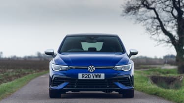
The Golf’s evolutionary path has continued with more subtlety outside than in, thankfully, with a design that’s clearly Golf but perhaps a little less resolved than before. The two-box silhouette that almost all rivals have since come to emulate remains, but both the surfacing and detailing have become a lot more complicated.
Up front, the Golf R’s look is at least more distinctive than that of earlier Rs, with manta ray-like upswept fins on the lower bumper breaking the grille openings. The thin LED headlights are more successful, but are joined by clumsy light strips that illuminate the spaces between the headlights. A near clamshell bonnet is usually a lovely detail, but it can give the impression of a big forehead in automotive design terms when paired to such a tall glasshouse.
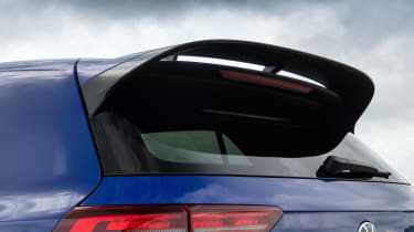
Non-Performance Pack cars on 18-inch wheels are very unassuming, but spec one up and things can get a little too aggressive, with the larger stacked rear wing of the PP looking unbalanced. Go for the larger Akrapovič exhaust and things get even more aggressive.
Curiously, VW has chosen to offer the R in just three colours – trademark Lapiz Blue, plus a simple black or white – but the wheel designs are generally well suited regardless of size. Unfortunately, it’s diamond-cut or black only for wheel finishes, and true Golf nerds will also lament the death of the Pretoria alloys. Golf 20 Years models look identical outside unless you get brave and choose the white paint and blue wheel option.


