Volkswagen Golf R review – interior
Clean design is completely undone by horrendous HMI
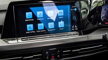
You might have already gathered that we’re not the greatest fans of the new Golf’s digital interfaces. This is not an anti-touchscreen thing – it’s just a bad system, plain and simple.
First there’s the interface itself. The initial menu structure is fine, but specific functions are buried under multiple menus that all largely look and feel the same.
The process of completing a task via a digital interface like this should be no more complicated than answering a simple question presented on-screen, yet the VW’s infuriating choice to both ask too many questions, and conceal the answers, is the irritating component. Want to lower the air conditioning temperature in a hurry? That will be a press of the climate menu. You’re then confronted with some very specific questions about what you want the climate control to do, none of which is what you’re after.
Noticing a ‘classic functions’ tab at the top of the screen, you press it. A lateral fan control then appears, so you stab the fan ‘down’ control multiple times thinking it’ll switch off once it’s at the lowest setting, but it doesn’t. Only then, when you’re frustrated, do you see an unassuming round button at the top left of the screen that’s the same colour as all the other controls that will switch the system off. It is infuriating.
More reviews
In-depth reviews
Reviews
Add to this that you’re probably trying to prod these small points on a screen while being bumped around and trying not to crash into the car in front of you. Oh, and you can’t rest your hand on the base of the screen either, as that’s where the volume control is located. Add to this a laggy response time from the system itself and, unless you’re the Dalai Lama, by now you’ll want to throw a fist through the screen, but know that 95 per cent of the car’s functionality will disappear alongside those eight inches of so-called digital intelligence if you do.
As for the rest of the cabin, well, the seats are good, as is visibility and interior space, but alongside the mass digital interface and pared-back design is a notable drop in material quality. Like so many other parts of the Mk8, there’s been an obvious fall off not just in execution, but also thought, as if VW put all its money and effort elsewhere.
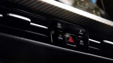
Weirdly, the combination of high-spec Nappa leather, real carbonfibre inserts and widespread use of glossy black plastic on the centre console combine to substantially raise the interior’s ambiance. The Golf’s reductionist design was always going to struggle to work unless the quality of the materials were top-notch, so on a model with noticeable upticks in this regard, it now makes much more sense.


