Toyota C-HR review - Entertaining Qashqai alternative - Toyota C-HR design
Lacks the performance to do justice to a capable chassis, but there's still plenty to like about the C-HR
Design
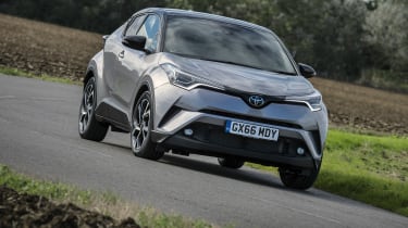
The C-HR’s exterior styling is the most dramatic we’ve seen since the Nissan Juke, and will be a love-it or hate-it factor for potential owners. We’re actually on the positive side of this divide; if manufacturers absolutely must offer crossovers, then they might as well be interesting to look at, and the C-HR is certainly that.
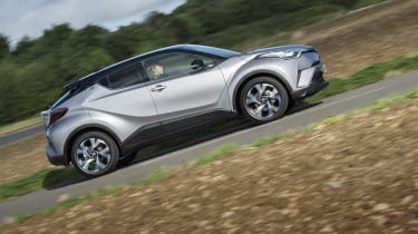
It’s hard to know where to start, but there are plenty of themes here: A squat, chunky stance, a fastback-style roof line, high-mounted headlights and tail lights, a nicely balanced profile, sharp lines, a “floating” roof, and a sharply rising waistline.
The side panels feature a dramatic swoop that starts over the front wheelarch, sinks to below the beltline and rises again towards the rear, while a contrasting black panel rises up from the sills to pinch the C-HR’s waist and remove some of its visual bulk.
It does get less weird the longer you look at it, and it makes the SEAT Atecas and Nissan Qashqais of this world seem a little bland. How well it will age remains to be seen, though the similarly unusual Nissan Juke looks no less dramatic today than it did the day it was launched.


