Toyota C-HR review - Entertaining Qashqai alternative - Toyota C-HR interior and tech
Lacks the performance to do justice to a capable chassis, but there's still plenty to like about the C-HR
Interior and tech
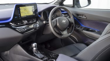
If you thought the C-HR’s exterior looked funky, then you’ll be similarly pleased by Toyota’s attempts to jazz up its cabin. The dashboard is dominated by a large upright touchscreen (which is still positioned low enough that it doesn’t obscure any area of the windscreen), while the cockpit is a riot of different textures.
In the past, this would have been a recipe for disaster, but in the C-HR it all seems to work, somehow. The C-HRs we’ve driven so far have all featured the same cabin colour theme, with the top of the dashboard separated from everything underneath by a metallic blue strip that’s so vibrant it almost looks like it’s illuminated. Above this you get purple plastic and black below, a theme that continues onto the door cards, which are illustrated with an unusual geometric pattern that looks like fabric but is actually textured plastic.
Given the unusual dashboard styling it’s almost a disappointment to discover that Toyota has used conventional analogue instruments - rival Peugeot now offers an Audi-style TFT display in higher-end versions of the 3008 - and that Toyota is still using the same LCD clock it’s been putting in cars for twenty years or more. Everything is fairly easy to read at a glance though (other manufacturers take note) and while the infotainment setup also seems a few years out of date, it’s simple enough to operate.
Everything is put together to a high standard too - not quite to Lexus standards, but perfectly acceptable for the class. Unfortunately, a few aspects do let the C-HR down. Adults will be fine in the back, with its rising window line, but children may not be too keen on their view out being blocked. And the tiny rear window and large rear pillars mean rear three-quarter visibility is poor, too. The high-ish driving position at least improves forward visibility.


