Tesla Model S review – interior and tech
The Model S has one of the most advanced, digitised interiors of any car, but it lacks the opulence of some rivals
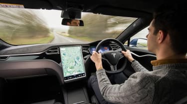
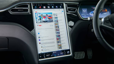
Although it’s expensive and it exudes a level or luxury and refinement from its chassis and drivetrain that would shame Rolls-Royce, the interior of the Model S is remarkably functional and basic. Its storage compartments are lined in rubber and its interior lacks any sort of decoration, particularly if darker cabin colours are selected. But there is a pleasing simplicity to its design. There are very few buttons, for example, thanks to the huge 17-inch touchscreen display that takes up most of the dashboard’s real estate and controls most of the car’s functions. The latest models receive a new dashboard layout with a landscape display, faster computing and even an onboard gaming system, but we're yet to try this.
Some will be put off by the need to dive into menus to control heating or radio, and although this is often frustrating in other cars, the Tesla’s clear interface makes it much less distracting than most touchscreen systems.
Perhaps the cleverest aspect of the screen and your interactions through it is the ability for Tesla to update your car wirelessly overnight. It’s entirely possible to come downstairs one morning to find your car has suddenly gained a host of extra functions, improved menus, and occasionally, even better performance.


