Tesla Model S review – design
Some will say the Model S looks a little conservative, but we like that Tesla has avoided trying too hard
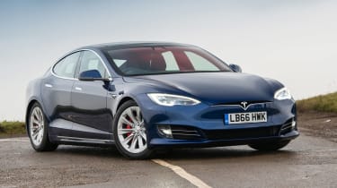
Is the Model S’s styling a little generic? Perhaps, though that could be deliberate. It looks imposing and expensive, and Tesla has resisted the temptation to adopt the weirdness that makes some other electric vehicles look like they’re trying too hard. However, without a big petrol engine the Model S doesn’t need to be the same shape as a conventional saloon and it seems like a missed opportunity not to have taken advantage of the more flexible nature of the drivetrain. There's almost no indication of the car's outrageous performance; even the top-spec Plaid model looks sedate and unassuming.
The Model S has coined the family look for Tesla and its most recent car, the Model 3, shares many of the Model S's features – albeit less attractively proportioned. That also applies to the recent Model X SUV.
Where the Model S looks more individual than regular executive cars is the closed-off front ‘grille’ – cooling demands of electric cars are less than that of internal combustion ones – and in its details. Sturdy metal door handles glide out to meet you as you walk up to the car with a key in your pocket, and the car’s charging port is hidden behind an unobtrusive door forming part of the rear light cluster units.


