Tesla Model 3 review – interior and tech
With no buttons, dials or column stalks, the Model 3's interior is extremely minimalistic – for better and worse
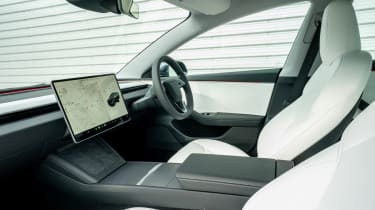
The Model 3’s interior is perhaps the single biggest area where Tesla differentiates itself from more traditional rivals. The interior layout is beyond simple, even austere to some, but beyond the lack of physical controls, it’s the digital interfaces that shape the way you interact with it. Nearly every function is bundled into one interface, and for the latest Model 3, that includes the gear selector on a vertical swipe controller on the side of the display. The indicators have also been relocated to haptic buttons on the steering wheel, and while they're responsive enough, they can be hard to locate once you've added lock (around a roundabout, for example). Put simply, these are solutions that create new problems of their own.
The infotainment system itself is responsive and clear, even if the number of features, icons and menus can be overwhelming at first. Making things easier is the fact that the mirror controls, seat placement and ventilation are all automated depending on the selected driver profile, meaning they rarely require any adjustment, even if someone else has been in the car before you. The sheer real estate on screen also allows you to see everything you could want or need at the same time, making the default on-screen map less of a hindrance and more akin to a handily placed passenger.
What this does is unlock the interior’s real party piece, with utterly fantastic front visibility due to the lack of obstructions and its very low scuttle. It really is an almost panoramic view down the nose of the car, something augmented by the large front window glass. All models also come with a glazed roof, made up of an unusual combination of a large single-pane rear windscreen that runs right up to the centre beam of the roof and a second piece of glass then fills in the gap to the header rail and front windscreen, leaving a cabin that feels open and luxurious with light.
Quality has taken a notable step up with the latest Model 3, and while there aren't many of the high-end, tactile surfaces you'll get inside a BMW i4, most of the materials are pleasant. An ambient lighting strip around the base of the windscreen adds a touch more visual interest, but the look and feel is as clean and minimalist as ever.


