Tesla Model 3 review – design
The Model 3 has sharpened up for 2024, but the shape is still unconventional and awkward from certain angles
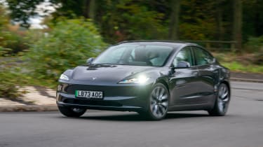
Whereas the interior design really does take full advantage of Tesla’s innovative stance and technical package, exterior styling is perhaps less successful.
Still working on an aesthetic derived from the original Tesla Model S Concept that was penned by Henrik Fisker, the Model 3’s cab-forward stance and low scuttle leave the Model 3 looking a little awkward from some angles, and downright odd from others. At any angle from straight-ahead to a front three-quarter, the vast windscreen and low nose look out of proportion. The facelifted front end is also rather dull, despite a set of sharper new LED headlights.
To hide the low scuttle, the Model 3 has a large amount of wedge in its profile, with the shoulderline and glazing rapidly rising towards the short, pert tail. Due to the single-piece rear windscreen and roof glass, the bootlid actually opens up like it would on a saloon, revealing a well-sized boot accessible through a relatively small opening.
Perhaps an example of Tesla’s relative lack of experience is the bootlid’s propensity to dump all the water collected into the boot upon opening, as it seems to just miss the boot guttering and splat right inside. The 2024 model's new tail lights do at least make it look much more modern from the rear.


