Mercedes C-class review – interior and tech
A huge jump in perceived quality and design, but you’ll have to like touchscreens
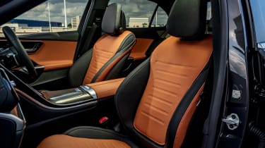
Merc’s ability to trickle down cutting-edge technology to its mainstream models is nothing short of amazing. When you compare the interior of this new model to that of the much bigger and much more expensive S-class, the similarities between the two are uncanny. Never has the gap between the two felt closer, and not just in terms of toys and trinkets, but material and build quality too.
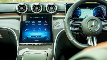
For the first time in generations the interior’s basic layout almost directly aligns with that of the new S-class, sharing the same 11.4-inch central touchscreen and 12.3-inch driver display. Both are bright, responsive and clear, and while the MBUX infotainment system can still frustrate, it’s far more useable with so much touchscreen real estate to work with. Material quality is also very good – the synthetic leather trim on the dash, door cards and centre console feels top notch, making the whole interior feel much more upmarket than rivals from BMW and Audi.
Unfortunately, not all is so bright with the interior, as alongside this strong foundation is a level of tinsel that varies between mildly annoying and obstructive. The steering wheel controls take a lot of time to acclimatise to, and you end up often accidentally brushing the touch-sensitive controls that could set off any vast variety of functions.
There’s no volume knob, instead a tiny slider does that job (badly, we might add) and completing even simple tasks does take your eyes off the road for too long, despite the simplified menu structure. And if you’re a driver that likes to keep the interior dark and cockpit-like, the technicolour interior lighting combined with the sheer size of the displays makes it a glaring experience, even when the brightness is turned right down.


