Mercedes C-class review – design
An inoffensive and sleek design that’s undone slightly by some garish detailing
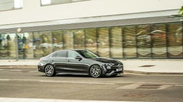
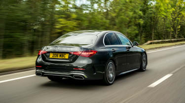
When Bruno Sacco oversaw the original W201 190E, its job was to channel the robust and hewn feeling of larger models into a smaller package. Over the last few generations Mercedes returned to this notion, and this W206 is no exception. The new C-class’s surfacing, detailing and proportions are so well synced with those of larger models such as the S-class you have to do a real double take to make sure you’re looking at the right model.
Yet in place of Sacco’s brutalist forms, Merc’s new design language under the leadership of Gorden Wagener is perhaps less successful all-round. While the surfacing is much improved, with a simple and restrained style, the C-class’s detailing is more contrived. A majority of UK models will be fitted with the AMG Line package, which features a dramatic downturn to the grille that almost pinches at its extremes – it’s more catfish than aggressor.
Mercedes’ obsession with using its own insignia as a base for patterned texture has also made its way onto UK-market C-classes, with the main three-pointed star (which also now houses the integrated radar system) joined by a grid of tiny repeats inside the grille opening. It’s all a bit garish and frankly just too over the top.
Overlook these occasional lapses in taste, though, and the new C-class fundamentally rests on its elegant proportions, sophisticated surfacing and crisp lighting front and rear. A definite shout-out must also go to the Digital Light LED headlights which are simply brilliant. The light emitted isn’t any brighter than that of other systems, necessarily, but the clarity and the software behind the anti-dazzle feature on automatic full beam is not just excellent, it’s also quite entertaining to watch from the driver’s seat at night.


