Volvo V40 review - can the alternative premium hatch beat the best? - Interior and tech
Smaller and less engaging than a Volkswagen Golf, the Volvo V40 has style and safety as its key strengths
Interior and Tech
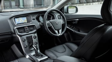
The interior is really the sticking point when it comes to the V40’s relative age. From new, the dashboard was borderline irritating, with small incognisant buttons and slow graphics. Compared to modern rivals like the Audi A3, the V40 is starting to lag very far behind. As mentioned above, interior space is lacking in the second row and boot.
If there is one saving grace for the interior, it is the build quality, surpassing most rivals bar the Audi A3 and some higher spefication VW Golf’s. In higher spec Inscription or R-Design Pro spec, the V40 can feel very plush indeed, while trendy finishes like Copper on the floating dash still look relatively fresh.
The V40 Cross Country tries to offer a slightly more rugged appeal with heavy grained leathers and metallic interior finishes if that is your thing.
It’s the infotainment user interface that struggles the most though, the small(ish) screen and graphics are all controlled through fiddly dash mounted controller, and although it works better than in previous V40’s, the whole system feels dated. Volvo is the leader in user interface design as proven by new models like the XC60, but older cars like the V40 are definitely in need of the new tech.
But the lack of new technology doesn’t extend to active saftey thankfully, as the V40 continues Volvo’s record of exceptional safety technology throughout the range.


