New 2018 Volkswagen Touareg review – a Bentayga without the badge? - Design
The all-new Touareg is full of engineering excellence, but it’s not in the pursuit of driver entertainment
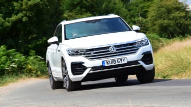
The fundamental design of the Touareg is typically VW: solid, crisp, but a little dull. But VW has fought its usual criticism with a little bit of creative exercise with the ornate front end dominated by the large chrome-filled grille and headlight arrangement. Similar in shape and execution to the VW Arteon, the Touareg’s nose is a ‘love it or hate it’ result. I’ll leave it up to you to decide which camp you’re in.
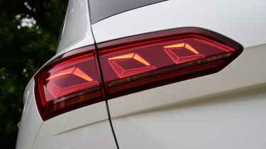
The rest of the design is one of the better efforts from Volkswagen of late, underpinned by a sound set of proportions. VW’s typically crisp surfacing and shutlines are in full force here, with a softly curving beltline that could slice through an heirloom tomato (probably). The lighting graphics at the rear are particularly fun, as cars fitted with the upgraded units alongside the I.D Matrix headlights light up in an interesting fashion when you hit the brakes.
Despite the more intensive use of chrome on the basic SE-L model, its smaller front openings seem to suit the overall shape better. Not that it’ll matter, as VW predicts most will head for the sportier R-Line, not least thanks to its bump in spec.


