Suzuki Swift review – a lively, tech-laden supermini - Interior and tech
The regular Swift and the Swift Sport share many attributes, but the hot hatch fails to live up to expectations
Interior and tech
The fresh, bright and colourful interiors of modern European cars make the predominantly black inside of the Swift seem sombre and dull. It’s far from a bad place to spend time and it’s put together very well, with decent materials, but there’s no sense of fun. It’s just very practical.
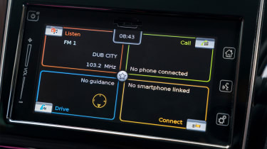
There may well be a selection of high-tech driver assistance systems (lane keep assist, collision warning, radar cruise control, etc.), but the infotainment screen is far from cutting-edge. The graphics look as though they’ve been borrowed from an early noughties PlayStation game, the touchscreen is often slow to react and the buttons are a little small to operate while driving. However, although slightly baffling to begin with, the menus and functionality is very easy to get used to and the sort of tasks you perform regularly – switching between satnav and the radio, changing stations – are easy to do quickly. The only exception to this is the lack of a physical volume knob. Instead there’s a touch slider on the dash or a rocker switch on the steering wheel, and neither is as easy, quick or intuitive to use as a rotary dial.
The Sport is very similar inside to the regular Swift. There’s a splash of red on the dash and the dials and the seats are a little more supportive, but nothing drastic. The cute, but ultimately useless, G-force readout and power and torque dials that look like little turbochargers on the Swift’s on-board computer are not limited to just the Sport; amazingly the regular car gets them, too.


