SEAT Leon Cupra (2014-2021) review - interior and tech
More imaginatively styled than the equivalent Golf but less carefully assembled. SEAT's in-car tech is aging, but easy to use
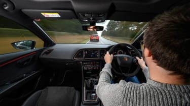
The cabin is unchanged from that of the outgoing model, so it feels solid and hard-wearing but lacks the design polish and overall build quality of the Golf’s – the group works hard to protect its carefully managed hierarchy.
Unfortunately, it also lacks some of the flair you might expect from a brand that trades so heavily on its old ‘Auto Emocion’ slogan – the Cupra’s cabin is unremittingly dark, and while the general layout is pleasant enough it’s hardly a soul-stirring environment in most forms.
The Cupra R’s sprinkling of copper elements and its Alcantara steering wheel do usefully lift the ambiance, but then you’d expect that of a model that pushes £40k when fully loaded. You never feel short-changed with interior quality – while never spectacular, it’s not disappointing.
As with all cars from our digital age, it’s the touchscreen interface that dates the interior, with a relatively low-resolution screen that struggles with contrast and laggy responses. Spend anytime inside a new Mercedes A-class or BMW 1-series and you’ll see how far the game has moved on in the eight years since this generation of Leon appeared.


