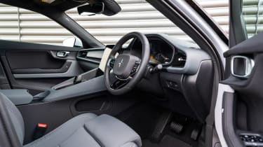
Polestar 2 review – interior and tech
Consider this Volvo interior 2.0 – clever design, decent build quality and an intuitive Google-based infotainment system
The Polestar 2’s five-seat interior is about equivalent in size to that of a BMW 3-series saloon, but with one or two caveats. The high scuttle and black interior trim can make the rear of the car feel quite tight, even with the standard-fit glass roof. Rear visibility is rather stingy too, and while the rear camera is clear and bright on the 2’s lovely display, a digital rear-view mirror as seen on various JLR products would be a welcome addition.
Dominating the driver’s aspect is a glossy upright tablet-style screen that mimics the path initially taken by Volvo and improves it with its Google-designed interface and clean graphics. Where a Tesla can feel stark, and almost submersible-like, the Polestar is more relatable to the mainstream, but with a definite edge in design, quality and operations.
The material use is generally well-considered, with artful uses of fabric and timber trims on the main of the dash and encompassing centre console. Cast your eye lower down though and it’s not hard to find more questionable surfaces, but Polestar has certainly invested in using the right materials in the right places.


