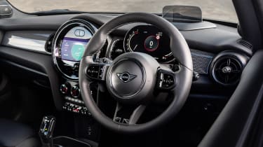
Mini Cooper review – interior and tech
The retro interior styling remains a love-or-hate attribute, but now the tech is falling behind and those ergonomics haven’t gotten any better over time
If there was an analogy to best describe the inside of the current generation Mini it would probably have something to do with an acid trip and a bubble machine. Now more than ever, this third-gen Mini’s interior is a hot mess of circle motifs, flashing lights and Duplo-like plastic buttons and switches. Inherent build quality is fine, better than most mainstream rivals in fact, but now feels every bit of its eight years, especially given it was little more than a riff of the dash from the previous-gen car, which wasn’t far removed from that 2001 original if we’re being fair.
Compared to cars such as the Honda e or Fiat 500 Electric it feels ancient – something that’s amplified by the off ergonomics and upright windscreen that, thanks to the BMW platform, sits way out in front of the driver. The tech isn’t inherently flawed, but it is a few generations behind BMW’s latest systems and isn’t as user-friendly given it’s accessed through an awkwardly shaped display and difficult-to-access rotary controller. An update in 2021 brought with it a new half-digital, half-analogue (despite appearances) driver information display. It works better than before, and is a big improvement on the horrible analogue dial pack that was there before, but it still feels like a solid afterthought.
An olive branch we can extend to the Mini’s interior is in its comparison to that of its key rival, the Audi A1. Unlike the first-generation car – which set a new standard in interior design at this price point – the current A1’s cabin feels as plush as an underground station in Berlin, with horrible plastics, a lazy, unrefined design and general awfulness.
Space in the Mini has also been improved dramatically over previous models, although the three-door is still only really a four-seater. Rear-seat and boot space are better, while storage in front is greater, also. The bluff, upright windscreen still informs the short dashboard and means forward visibility is pretty good, the A-pillars being of minimal hindrance to your view out, but overall the Mini feels like a much larger car inside than its predecessors.


