Mercedes AMG GT (2014-2022) review – interior and tech
Can feel cramped, and tech is a generation or two behind newer Merc models, but is full of drama
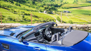
Like so many aspects of the GT, the experience from within the cabin is driven by the car’s proportions. The seating position is low, with a wide, ungainly console rising to meet the flat broad dash. Its windscreen is upright and sits closer than you would otherwise expect, with the bonnet stretching out to what feels like the horizon. It’s an experience that’s markedly different to what you get in an R8 or 911, their low-scuttles opening up great visibility.
The GT’s low and wide stature is only compounded by the four-wide air vents, atop which sits the infotainment screen that controls generation-old software. A second high-resolution colour screen has also replaced the previously analogue dials ahead of the driver, while the steering wheel is a unit borrowed from other AMG models which looks oddly shaped and uncomfortable but is quite comfortable and intuitive to use.
The centre console is a highlight. It has a clever arrangement of buttons made from eight tiny colour screens designed referencing the V8 sat beneath the bonnet. Everything from driving dynamics to the exhaust is controlled via these 8 buttons, each changing the display actively depending on the chosen setting. It’s certainly clever, if possibly overkill. These are then joined in some models by the same colour-coded screen controls attached to the steering wheel offering the same functions.
Overall quality is impressive too, and while it might lack the tech of a modern 911, or theatricality of an Aston Martin Vantage, the interior is an impressive element of the GTs package. Black Series and GT R models both build on this basic cabin architecture with subsequently more aggressive bucket seats and optional roll-cages, but the basics remain unchanged.


