Lamborghini Huracán Evo review – interior and tech
Perhaps the only step back made during the Evo update. There’s more screen, but less intuition this time around
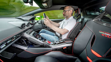
The Huracán’s interior went through quite a substantial update alongside the Evo’s introduction in 2019, swapping the original’s button-heavy central bridge for a more modern portrait-layout touchscreen. While this might appear to improve the interior’s interface and useability, the opposite is actually true, as the screen itself is both awkwardly placed and not very responsive.
It also takes away some key controlling elements that make simple tasks such as adjusting the volume or temperature more complicated than it should be. Paired with the steering wheel’s lack of stereo controls in favour of Ferrari-like indicator and wiper controls, it makes the Huracán quite irritating to operate on the move.
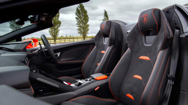
Quality inside is very good though, and start digging through the options list and very plush materials such as naturally finished leathers, contrast piping and a near infinite choice of colours for the dash and doors make specifying a Huracán an equally thrilling and terrifying experience on account of the easily added expenditure.
Yet as a daily driver the Huracán’s packaging limitations leave the biggest impression, with almost no small item storage in the centre console, and a frustratingly small centre cubby that’s not big enough to fit most modern smartphones. Yet the biggest oversight is the very tight quarters for tall drivers in the Spyder, with anyone close to six feet tall forced to put the seat into its furthest-back position in the space used to house the folding fabric roof.


