Jaguar F-Type (2020 - 2024) facelift – interior and tech
Isn’t nearly as dated as its age would suggest. It’s snug, intimate and well built inside; tech is improved, but still not class-leading
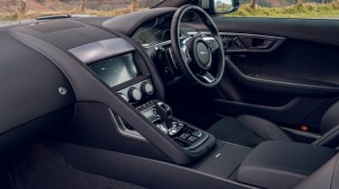
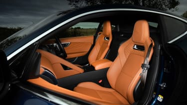
There’s an old adage that good design doesn’t date – this is something that rings true on the F-Type. The interior, despite its considerable age, still looks and feels excellent. The chunky, substantial dash volume and high scuttle makes the F-Type feel initially intimidating, but the seating position has plenty of adjustment to find the right balance between feeling encased, yet still being able to see out.
The asymmetrical dash layout is dominated by the passenger-side grab handle and joystick-like gear selector, both of which retain the authenticity of an interior driven by design, rather than technology. The F-Type’s slick pop-up central air vents and simple, clear air-conditioning controls also remain.
> Jaguar F-type (2013 - 2019) pre-facelift review
The downside to this dash architecture is that Jaguar's latest twin-screen infotainment system isn’t able to be integrated into the new model. The standard single-screen system works well enough though, especially if you’re the sort to use phone-mirror applications like Carplay or Android Auto.
The new driver’s display is also an improvement on the previous model’s, with a slick high-resolution appearance and fresh graphics, although like other JLR models, this is hobbled somewhat by a slow screen refresh-rate. While that sounds like an odd thing to be irritated by, the stuttery rise and fall of the rev counter needle and speed readouts are an issue shared with an odd cross section of other modern cars; Volvos and Fords seem to have the same quirk.
Build quality on the whole is good and at a £50k price point feels excellent compared to rivals from Alpine and Toyota. When you’re approaching triple figures it starts to feel a little underwhelming though, especially when compared to a new 911 or the superbly built Lexus LC500.


