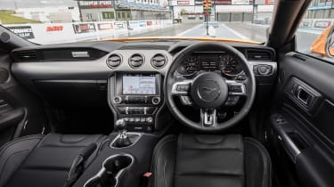
Ford Mustang (S550, 2015 - 2023) – interior and tech
A distinctive design let down by poor ergonomics and build quality
The muscle car persona is just as visible inside the cabin, with the dashboard architecture taking inspiration from Mustangs of the past. However, it’s not quite as commodious as its enormous exterior dimensions might lead you to think, thanks in large part to supersized elements such as the seats, centre console and dash.
Build quality is unsurprisingly a weak point, with hollow materials and a lack of solidity around the doors, dash and console that do take the shine off the now pretty serious price point. Ford has tried to make things interesting, though, with plenty of (faux) stitching and (faux) metallic plastic trim brightening up the otherwise dark interior.
> Ford Mustang Shelby GT350R review – A muscle car for the track
Tech is better, however, with Ford’s simple infotainment system joined by a surprisingly high-resolution digital dial pack. And while the variety of information shown isn’t that configurable, there are plenty of options as to how the Mustang’s basic info can be displayed, with various colours, rev counters and shift light options allowing the driver to make it their own.
The standard seats severely lack side support, and although squishy and comfortable for short periods they begin to wane over longer journeys. Recaro seats are available as an option, which we would highly recommend, but all seats sit far too high and come with limited adjustment, especially for short drivers (like yours truly).
Cabin noise is fairly low – unless you’re really extending the engine – and there’s only a rustle of wind and tyre noise. It all feels very American in fact, but in the best way possible. Pity the view over the long bonnet is of a rainy, windswept UK rather than the Pacific Coast Highway.


