Ford Focus review – interior and tech
The cabin is functional and well built. Tech has been totally overhauled with a big new touchscreen interface
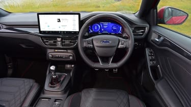
Much like the Focus’s general demeanour, its interior is functional, paired back and simple. The fundamentals are good – you sit fairly low yet have good visibility out thanks to the upright windscreen and thin A-pillars.
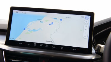
The dashboard is largely the same as before, but the screen that sits on it is now positively huge in comparison to the previous model. At 13.2-inches diagonally, it now forms the dominant element in an otherwise fairly plain interior, looking like it only just fits on its little shelf.
The extra size also displaces the physical volume knob and other media controls to the location previously used for the climate controls, which themselves are now integrated into the screen. Sacrilege! you might scream, but they are situated in an immovable bar across the base of the screen, and so work perfectly fine. The rest of the digital interface is also well resolved, with enough screen to multi-task, paired to a general user-friendliness that puts many rivals from the VW Group and Stellantis to shame.
On high-end trim levels sits yet another screen, this time in front of the driver, but we’re less fond of its strange graphics, and its slight latency doesn't really add to the interior experience. Low-spec models have the previous analogue dial set-up, which is clear, clean and has a smaller display integrated within it that gives you all the necessary information.
The interior isn’t exactly plush, though, and lacks some of the glamour that rivals have begun to offer. While ergonomically restrictive and not as user-friendly, the interior of a Peugeot 308 feels far more upmarket, and comes with lots of luxuries that make even a fully-loaded Focus feel a little basic.


