How to design a car (part three): the C-pillar
A distinctive C-pillar design can help give the side of a car a unique character, but, as Stevens explains, those designs don’t always hit the mark
I am sure that every evo reader will know what a C-pillar is, but where did the terms A, B, C and D-pillar come from? The names were first used in the late 1950s and originated in America. During the coach-built-body era there was no formally accepted way of naming the pillars. The windscreen was supported by the ‘screen posts’; the next pillar back was usually called the ‘door post’. This was the strongest pillar since it supported the weight of both the front and rear doors, it being the time when rear-hinged ‘suicide doors’ were the norm. There doesn’t seem to have been a common name in that era for the next pillar back, apart from ‘lock post’ maybe, on a four-door.
There are suggestions that it was insurance companies that wanted formal naming of the pillars to clarify insurance claims, or crash rescue services who wanted an easy description of which pillars to cut to extract a car’s occupants. So, A-pillar at the front, B comes next, C is the rearmost one on a saloon or hatchback, and D is the last one on an estate car, MPV or SUV.
The C-pillar has always offered designers the opportunity to introduce a little ‘design flair’ to what would otherwise be a fairly nondescript side view. BMW’s director of design from 1955 to 1970, Wilhelm Hofmeister, introduced a little kick-up to the rear of the window sill line on both the 3200 CS and 1500 that were introduced at the Frankfurt motor show in September 1961. This feature became known as the ‘Hofmeister Kink’ by both the press and then BMW. Apparently, there is uproar over its recent disappearance.
> How to design a car (part two): front grilles Add to Default shortcuts
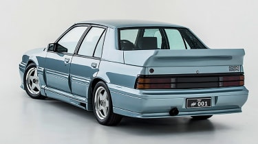
Back when Tom Walkinshaw was in charge of Holden’s racing programme, I looked after the touring car aero development and body design of the VL Commodore. In the wind tunnel we found that by altering the angle of the rear screen glass we could achieve lower drag and greater rear downforce. Reading the regulations with Walkinshaw we saw that the rear screen and decklid were ‘free’. What this actually meant was that there were no restrictions on the material from which they could be made, but to us is meant that we could do what we liked with them! Flatten the rear screen angle, make new C-pillars and raise and angle of the bootlid; it all worked rather well!
Alongside the conventional rearward sloping C-pillar, there have been reverse-angled C-pillars like those on the Ford Anglia, the wacky Citroen Ami 6 and, one of my favourites, Patrick le Quement’s outrageous Renault Avantime. Every aspect of this brilliant, if flawed, mould-breaking car challenged contemporary thinking, and in many ways it still looks more appropriate than most present-day cars for the new typologies that hybrid, hydrogen and electric power sources suggest. Whilst the Anglia’s C-pillar was unconventional it still looked like a strongly engineered piece, but in the mid-1960s Chrysler produced a number of models with C-pillars that were wide at the top narrowing down to almost a point where they met the body of the car at their base. The greenhouse looked lighter but structurally they looked weak – they probably were too.
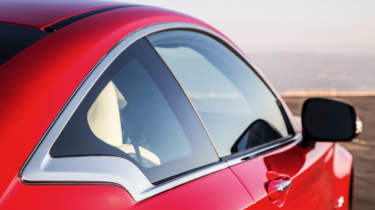
Apart from bizarre body side sculpture there is not much to differentiate one modern car from another in side view, and so once again design of the C-pillar has become an area for stylistic whimsy. Particularly when it comes to either hybrid or electric cars, an opportunity for ‘The New’ is never turned down. Renault invented an inexpensive production painting technique that allowed the colour of the C-pillar to change halfway down the panel on the early Captur. There has been a mad scramble to copy this two-colour effect but most manufacturers have followed the old-fashioned method of covering the joint line between one paint colour and another by adding a bit of chrome trim. Vauxhall has chosen to add to that piece of chrome on the little Adam city car by taking the trim across the C-pillar and up and over the side glass, which produces a strangely ‘vintage’ appearance.
Vauxhall has developed this style language on its more recent Mokka-e, while Renault has added its own chrome to the new Captur. To quote another magazine’s road tester: ‘The C-pillar is much more substantial and stylised on the Mk2 Captur than on the original model. The chrome strip makes for a smart-looking dividing line between the body and contrasting-coloured roof.’ Interesting use of the words ‘stylised’ and ‘smart-looking’ – we are talking about decorative trim here.
In 2009 Infiniti, not usually known for styling excesses, introduced the Essence Coupe Concept, the C-pillar on which took a journey of exploration across the surface of the car that was all swoops and curves. The production Q50 and Q60 both had very watered-down versions of this strange detail, after which it seems to have almost vanished, until reappearing at the top of the C-pillar on the latest QX50, yet relating to nothing else on the car.
There have always been concept cars that, rather than exciting potential customers with creative new ideas for body design, have simply disappointed when the production version appeared. The Tata Nexon EV concept, shown at the end of 2019, had a dramatic roof form that was also in effect the C-pillar and which floated just above the body side. This was an original and bold look but it had vanished when the car was launched, replaced by a white roof, black C-pillar and body-coloured side. A wasted opportunity. Similarly, the Citroën Cactus production car never had the originality of the design sketches or the 2013 concept, which had C-pillars that appeared to float between the roof and body.
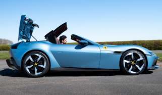
A final thought: almost every current or anticipated supercar, whether coming from Ferrari, Lamborghini, Aston Martin, Koenigsegg or GMA, or even some very obscure optimistic manufacturers, has followed a very similar current trend with the C-pillar design. It’s a sort of turned-up collar look, maybe as a protection against the chill wind of doubtful sales.
