The best in-car infotainment systems - which manufacturer does tech best?
We select our favourite car tech
Modern sports cars do a pretty good job of making the boring parts of a journey interesting. Infotainment systems now rival the functionality of an iPad, while navigation has moved on to the point that it’s virtually impossible to get lost.
Nearly every car currently on sale has some sort of infotainment system included in its base price, but a few manufacturers provide stand-out kit over and above the competition. Here are our favourites.
Best controller - BMW iDrive
iDrive started out as a convoluted mess of a system, but has evolved over its various generations to become one of the best navigation and entertainment systems on the market.
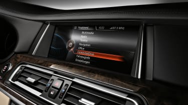
In its latest iteration, seen in the new 7 Series, the functionality available is truly excellent. Admittedly, iDrive does suffer slightly from ‘feature creep’, that is adding unnecessary tech in order to make it seem fresh, but ultimately it does the basics brilliantly.
Every car in BMW’s range features a simple click wheel controller for iDrive with 7 buttons around it. As much as manufacturers want us to start using voice control and touch screens, physical buttons are still the best for when you’re driving.
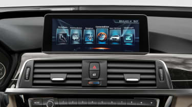
BMW lets you option bigger screens in its entry-level vehicles when navigation is specified with the car. It’s well worth doing, not only because BMW’s navigation system is clear and easy to use, but also because the bigger display just looks so much nicer. HD resolution and with excellent colour reproduction, it’s worth the added outlay.
Ultimately, where BMW wins out is with its simplicity. Most people want nothing more than music and navigation from their infotainment systems and BMW has this nailed. Each button on the click wheel lets you quickly swap between settings, while muscle memory means you’ll quickly be able to swap the display between the map and radio without needing to look down.
The navigation system is easy to use and rarely puts a foot wrong. Data entry can be done via voice and for the most part, it works quite well. Alternatively, the click wheel can be used to input individual letters to create an address, it's not the fastest way of doing things, but predictive address entry speeds the process up.
Being able to split the screen into two seperate functions, say music and navigation, is very useful and thanks to the wider panoramic display, means it doesn't feel cluttered.
Extra functionality includes Connected Drive which lets you download services and apps to your iDrive system. The best of which is Spotify, which adds another layer of entertainment to the car.
Audio quality is largely good from standard across the BMW range, although optioning the more expensive Harmon Kardon audio in the 3-Series does add a welcome boost in terms of sound. The 7 Series, with its full Bowers and Wilkins system, is the best in-car sound system we've ever heard.
The biggest failing for us with iDrive is BMW's lack of support for Apple CarPlay. It is set to come later this year, but it stops an otherwise excellent system from being the best overall here.
Best budget - Volkswagen Discover
Where Volkswagen wins out is with its sheer speed and ease of use. Simply put, this is the fastest navigation system tested in a car.
It boots up quicker than the competition, pairs your phone faster and offers up navigation quicker. The inclusion of CarPlay adds some much needed functionality, but ultimately, this is a simple no-fuss nav that is all you’ll ever need.
>Read our Volkswagen Golf review
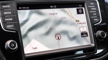
The screens VW uses aren’t the nicest out there and while easy to view in direct sunlight, they don’t boast the HD colour-rich displays of the competition. Instead, the setup here is all about carrying out actions with the least possible number of buttons pressed.
Discover is also one of the only systems to use hardware buttons and a touch screen, but do away with a clickwheel. This wouldn’t work if the tech was slow or laggy, but the screen is responsive to presses, meaning data entry is straightforward and easy.
The map too isn't home to the slickest graphics, but you'll get your address entry done quickly using the on-screen keypad. It also doesn't put a foot wrong and has easy to follow voice instructions.
In-car audio as standard is good, but if you've got a VW Golf, we highly suggest optioning the Dynaudio hi-fi upgrade. For the money it's truly excellent, bringing exec-level audio to a less premium market segment.
Ultimately, paired up with Apple CarPlay, VW's Discover system is all you should ever need. The sheer speed of use is a particular boon, especially as most infotainment control inputs take place the moment you start a car up.
Best user interface - Audi Virtual Cockpit
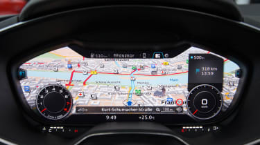
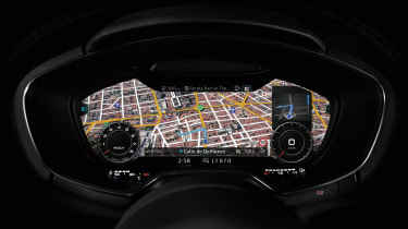
First making an appearance in the new TT, the ‘virtual cockpit’ system does away with multiple displays and instead tries to incorporate all of your infotainment into the instrument cluster.
Using a number of screens each devoted to one single function, music for example, you can control every element of Audi’s MMI without losing sight of the speedo or RPM counter.
On the face of it, this sounds distracting and convoluted, but instead Audi has kept things simple and delivered a first rate user experience. A single ‘view’ button on the wheel lets you alter the size and shape of the cluster, while everything else is controlled by up and down arrows.
It’s quick, clear and concise and in many respects offers the same speedy functionality that VW does, but with slicker and cleaner graphics. By bringing everything into one place and then having the infotainment governed by a number of simple menus, the number of inputs needed to carry out an action is greatly reduced, making for a much nicer user experience.
Where Audi does fall down slightly is with its navigation system. Yes the maps are the best in the business and having directions straight in front of you is excellent, but addres entry is over complicated.
The touch pad on top of the MMI click wheel, like that found in BMW, just isn't easy to use, while voice recognition isn't quite so good. As such you're left using the clickwheel to get to where you want to go, but suggested results never seem to be quite what you want, leaving you to have to enter the full address each time.
Best overall - Mercedes COMAND
Unlike BMW, the user experience you get across Mercedes’ model range is pretty varied. The S-Class, while boasting an absolutely vast number of features, is actually slightly convoluted in its execution.
Too many touch points and methods of control mean you’re left clicking through multiple menus to carry out straightforward functions.
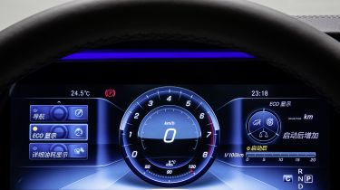
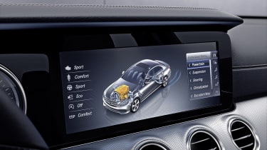
This has all been rectified with the new E-Class which takes all the lessons learned from the S-Class and streamlines them. You have a pair of beautiful crystal-clear HD LCD displays one of which acts as a digital instrument cluster, the other for maps and music.
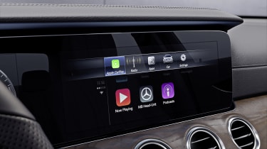
Crucially, the inclusion of Apple CarPlay and Android Auto means you can use the left infotainment screen to browse all your music, media and maps and then keep the instrument cluster clutter-free.
Connected to an iPhone, with CarPlay’s expertly designed simplicity, it’s all you should ever need from an infotainment system.
Maps and navigation look excellent, while address entry is quick and suggestions logical. The navigation system also does a great job of using internet connected results to help find local points of interest. It's one of the best out there and when setup full screen on the Mercedes' display, is clear and easy to use.
>Read our Mercedes E-Class review
We also like the way the user interface works. The main menu lets you get to functionality quickly, but a pop-up menu with the most important functions can be raised at any point in time, letting you skip across the user interface instantly.
Mercedes likes to introduce updates to its interior tech throughout a product’s life-cycle, so hopefully the rest of the range should follow. The E-Class has set the standard for in-car tech to come.
