DS 5 review - French premium offering doesn't quite hit the mark - DS 5 interior and tech
Style and character in spades, but DS still has work to do if it's to dethrone the traditional premium brands
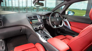
In many respects, the DS 5’s cabin is its most appealing feature. The first thing you’ll notice when stepping inside is how high you appear to be sitting – very crossoverish – and the second is the unique view out of the front.
With the front windscreen at such a rake, DS Automobiles (Citroen, in reality) has seen fit to split the A-pillar in two to enhance visibility – one element flanks the windscreen, the other the leading edge of the door. The glass panel in between is actually ideally placed to squint around corners and the pillars themselves seem relatively narrow, so visibility isn’t compromised.
It’s relatively good in all directions in fact, and combined with the ‘cockpit roof’, which has an individual glass panel above each front occupant and a larger sunroof above the rear passengers, there’s a glassy feel to the cabin. Our only concern is that taller passengers may struggle for headroom, as the complicated roof arrangement seems to intrude quite significantly.
The dashboard itself looks fairly good, as does the leather and brushed metal steering wheel and the fighter plane cockpit-style instruments. The seats are very comfortable too and between wheel and seat there's good adjustment, though rear passengers don’t have quite as much room as you’d expect.
It’s a refined, relaxing environment too. Noise levels are minimal on all but the poorest surfaces, with relatively low wind noise and not too much engine grumble disturbing the cabin. Combined with the unusual view out the front and the squashy seats, it feels a little like piloting a TGV train.
The cabin is let down by a few ergonomic oddities, however. One is the flat-bottomed steering wheel, which feels unusually large. Another is the 7-inch touchscreen, which is a bit pokey by modern standards, mounted at precisely the right angle to make it impossible to read when it’s sunny outside, is a little too far away not to have to stretch, and feels old-hat to use. The placement of some buttons and switches is daft too – the hazard button is an even greater stretch away than the touchscreen, and the rotary heating controls (good!) are squashed behind the gear selector (bad!).


