Cupra Leon review – design
New ‘shark nose’ face lends more distinction between Cupra and SEAT.
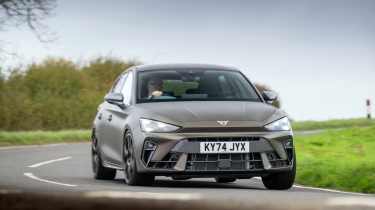
The last Cupra Leon was almost completely indistinguishable from one with a SEAT badge on the front. Happily, the new Cupra corporate ‘shark nose’ snout, with its distinctive light signatures, gives it a personality of its own. The rest of the car hasn’t had quite such an overhaul, though the new wheels and rear lights are a worthy tart-up.
Inherently, this generation of Leon’s exterior design was always well executed and resolved. The windscreen has been brought closer to the driver, giving it more of a distinct two-box silhouette, while the body sides and basic proportions are simple, clean and less awkward than the Golf’s 'receding hairline' look.
What wouldn’t have gone amiss is a bit of distinction between the 300, the true hot Cupra Leon, and its 1.5-litre and PHEV siblings. These versions are for want of a more sympathetic appraisal, the ‘M Sport’ spec of the Leon range. So why doesn’t the top-level car get the full on ‘M3’ treatment, beyond a set of quad exhausts and a chunky intercooler visible through the grille at the front?
Cupra’s penchant for matte colour options does help – this ‘Century Bronze’ hue is a corker. With a whole brand to represent, the updated Cupra Leon is more distinctive visually than before, with potential still left on the table. A 333-spec 'Cupra R' hatch with arch extensions, wings, sill extensions and even funky graphics sounds good to us.


