BMW X5 review - how does it compare to the Porsche Cayenne? - Interior and tech
BMW’s original SUV is still its best, still handling like a big 5-series. It’s just a shame it means so much less today…
Interior and tech
Viewed in isolation, you might be well impressed with the new X5’s interior. BMW is debuting a new interior architecture, infotainment software and driver interface components in the new X5, which has already spread to the incoming 8-series Coupe, Z4 and 3-series.
Immediately obvious is the replacement of BMW’s traditional round dials, replaced for BMW’s new active driver information display, with new graphics and more functionality. Unfortunately, BMW has perhaps forgotten to recognise the reason round dials worked so well, as the new rev counter and speedometer, which arc around the perimeter of the display are almost completely illegible at a glance. BMW says that it has been designed as such to try to integrate as much other driver information as possible into the display directly in front of you, but there just isn’t enough definition between your actual speed, the speed limit and your cruise control speed setting to find it in your peripheral. BMW offers an optional head-up display system which goes some way to fix the issue, but it’s not standard, and when set up with all the available information is just as illegible.
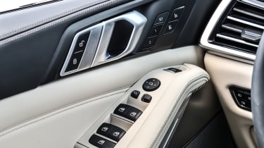
The rest of the dash works significantly better, with main controls grouped on the main of the dash, and new climate controls set between the main vents. This is a slick and easy-to-use layout that works far better than the climate functions of older BMWs like the current 5-series. But along with this simplified dash, the X5 suddenly becomes very sensitive to colour and trim. The optional ‘Individual’ leathers and trims of our test cars looked lucious and expensive, but when replaced with black plastics and lesser-quality leathers, it might turn out to be a little low-rent.
A special mention must go to the crystal-appointed gear selector and iDrive controller. Although it is a matter of taste, the cut-glass tumbler look, combined with an internal glowing insignia is definitely a strong statement. Unfortunately, the bit of plastic that your fingertips actually come into contact with is a cheap-feeling, textured section, which is considerably worse to touch than a normal leather selector. The iDrive, or BMW Operating System as BMW would prefer us to call it now, is still better than Merc’s units, but perhaps less intuitive and glamorous than the twin-touchscreen set-up found in the Audi Q8, or the massive 15-inch screen in a Volkswagen Touareg.


