F80 BMW M3 review (2014-2018) - design
The latest updates to this performance car icon have improved it greatly, it now has the composure to match its mighty performance
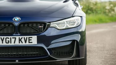
The M3’s bumpers are almost as complicated looking as an F1 car’s wing, with multiple intersecting parts, vents and scoops. It means the F80 isn’t as clean or as elegant as previous versions of the M3, but it certainly looks mean and purposeful.
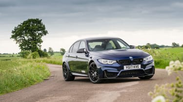
A lot of that aggression comes from the M3’s flared arches, which are more significant than those of its coupe alternative, the M4. Both the M3 and M4 share the same suspension and track width, however the standard 3-series is narrower than the basic 4-series and so the saloon’s arches have been stretched even further to cover the wider M-car track.
Coupled with a low, nose down stance and a set of aerodynamically shaped mirrors the F80 looks appropriately tough and sporty, just like an M-car should.
Differentiating the facelifted, 2018 model-year car from earlier versions of the F80 M3 is a task for dedicated BMW fans. The most obvious changes are limited to the front light clusters that includes LED headlights and light bars for the daytime running lights.


