Audi RS3 2025 review – can it topple AMG’s A45 S?
The RS3 has one of the most spectacular engines you'll find in a hot hatch, and the rest is just as good. Is that enough to warrant a £60k+ asking price?
Hot hatches are dead. We know this because everyone keeps saying it, so it must be true. Except that no one appears to have told a handful of manufacturers. In the last year BMW has updated its M135, Mini the John Cooper Works and Toyota has revamped the GR Yaris. Mercedes-AMG still sells its A35 and A45 S models, and then there’s the VW Group, which has launched facelifted versions of the Golf GTI, GTI Clubsport and R, as well the Cupra Leon. Audi has been busy too, releasing tweaked versions of the S3 and snorting, five-cylinder RS3.
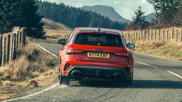
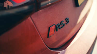
In terms of its power, tech and price tag (£60k), the RS3 sits at the apex of modern hot hatches, packing the kind of performance and sophistication you’d find in a full-blown supersaloon or sports car from not long ago. Partly because the RS3 is such a strong seller – it’s the best-selling Audi RS model in the UK, and globally – the changes for 2025 are mild rather than headline-grabbing. So that means adjustments, updates and fine tuning of the core components that elevated the RS3 from an okay hyperhatch to new dynamic heights when this generation arrived in 2021. Can it go toe-to-toe with the likes of the Mercedes-AMG A45 S, and similarly priced pure sports cars like BMW’s M2?
Engine, performance and 0-62mph time
As ever, the latest RS3 is dripping with big numbers. A few of the defining ones remain the same: five cylinders and a single turbo for the 2.5-litre engine that produces 394bhp and 369lb ft are unchanged from its predecessor. It’s still furiously quick as a result, with a 174mph top speed and a sub four-second 0-62mph sprint time, and it’s now five seconds quicker around a certain circuit in Germany, completing the near 13-mile lap in 7 minutes and 33.12 seconds, obliterating the previous record for compact cars held by the BMW M2 by more than five seconds.
More reviews
The five-cylinder motor still delivers its rich, broad torrent of boost-fuelled power and torque, firing it along the straights to an addictive, howling soundtrack that has hints of Lamborghini V10 about it. It’s supremely flexible, more so than the highly-strung four-cylinder A45 S, pulling heartily from low revs and delivering a satisfying mid-range sucker punch. It’s easily the most exotic and special engine you’ll find in a modern hot hatch.
The shifts of the seven-speed S‑tronic gearbox aren’t as quick, however; both up- and particularly downshifts suffer a slight delay, so that on some occasions you’ll pull the left paddle twice, thinking the first command for a lower gear didn’t get through.
Technical highlights
Key to the dynamic leap taken by this generation of RS3 is Audi’s ‘torque splitter’ rear diff, which can apportion torque across the rear axle depending on which wheel requires it and can handle it. Up to 50 per cent of the engine’s torque can go to the back, but all of that can then be sent to a single rear wheel – the outer one to reduce understeer (or make the car slide), or the inner to improve stability when required.
As a result the RS3 has gone from a big-numbers, straight line speed-focused hatch to one that can be manipulated, tweaked and adjusted – one that actually relishes being played with through any given corner. If you find an empty car park or a circuit that turns a blind eye to drifting, the RS3 can be made to slide around until its tyres delaminated.
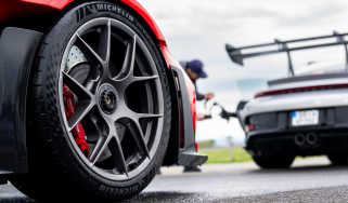
Speaking of tyres, the RS3 unusually comes with a staggered 19-inch setup with wider fronts (265 section) than rears (245 section), again with the goal of reducing understeer. Other dynamic aids include torque vectoring by braking, switchable ESC with a half-way Sport setting and RS-specific suspension and adaptive dampers. These elements are linked together via an electronic driving dynamics controller, which has been retuned for the facelift.
Ceramic brakes are available as an option for £4590, which may be worth considering if you plan to use this monstrously powerful, 1565kg hot hatch on track.
Ride and handling
The RS3 is hugely exciting – it doesn’t have the poise and feedback of a Civic Type R, but its brutality and layers of adjustability give it a wholly different appeal.
In Comfort mode it plays the relaxed daily driver role well, but ramp up the drive modes, lean on it harder and a genuinely entertaining character emerges. That wonderful engine is central to the experience, but the way the RS3 puts its performance to the road is equally fascinating. In some respects it behaves like a front-drive hot hatch, hunting along bumpy roads with subtle kicks of torque steer. In others it’s more like an old touring car, in the way that it fights for grip and can aggressively hop over the road surface under full power.
With the dampers set to Comfort there’s plenty of body movement – under acceleration the body squats down hard over the back axle – which almost allows you to play out your Group B Quattro fantasies. The firmer settings give more control, and as you up your commitment, the trick rear diff provides a helping hand. At first the rotation you get under power can feel a little alien, but trust the car, be aggressive and it rewards you with moments of genuine excitement, the rear kicking wide out of slow corners while the front axle simultaneously drags you forwards. In the most aggressive Torque Rear mode, meanwhile, the diff makes the RS3 feel rear-drive in a way that’s completely foreign to older RS3s.
Ultimately, the RS3 isn’t as tactile or immediate as a Civic Type R, or as cohesive and confidence inspiring as a GR Yaris. But exploring its peculiar dynamic makeup is a rewarding process, and the awesome presence and sound of the five-pot motor can’t be denied. On the road, it's more approachable and absorbing to drive than its closest rival, the Mercedes-AMG A45 S. More comfortable, too.
Getting it on a track allows you to explore the full might of the performance, and the subtleties of how the four-wheel drive system works. The RS3 doesn’t feel as racy as its rival from AMG, with a more upright and less hunkered down feel, but there’s a wide window of adjustability to play with all the way from corner entry to exit. The front end is very positive, so you can turn in on the brakes to hook sharply into an apex, before picking up the throttle and feeling the torque splitter working to keep the balance neutral. Given the torque from the engine, you don’t need to live at high revs, instead letting the mid-range do the work and surging onto the next straight.
Go harder and earlier with the throttle and, depending on the level of assistance dialled in, there are three possible scenarios. With all aids active you’ll get a steady push across the front axle and some nagging electronic interference. Turning traction control off but leaving ESC on allows some movement at the rear, requiring a few degrees of correction before the electronics gather it up. Switch everything off and the torque splitter starts giving you more options, and the ability to hold long, controlled slides in the Torque Rear mode. It’s a more expressive and exploitable car than many would expect.
Interior and tech
A new squared-off steering wheel and revised optional carbon-backed bucket seats (£2500) are the main changes for the new RS3’s interior, which retains the same angular, slightly gloomy ambience as the outgoing car. There isn’t much in the way of design flare inside, but the cabin is generally well-built and packed with tech, including a central 10.1-inch infotainment display and a 12.3-inch Virtual Cockpit dash.
Fit and finish is good but there isn’t the deep-seated quality feel you get from older RS3s, with dull plastic finishes and glossy elements that we suspect will be covered in fingerprints and scratches over time. The new square wheel isn’t necessarily an upgrade either, with a more awkward shape and easily mispressed haptic controls on the spokes. The pair of red drive mode shortcut buttons – similar to what you’ll find in an M car – are a nice touch, though.
The digital interfaces are clear and functional, with a highly configurable dash, and Audi has thankfully mated these with a bank of physical climate controls. There are some odd inclusions – the sliding square slab of plastic that is the gear selector, for instance, and the touch-sensitive volume/track dial (what’s wrong with a knob?) – but it’s generally an intuitive and well-designed cabin, if not the most visually interesting.
Price and rivals
As outlined at the beginning, the hot hatch market is in rather rude health at the moment, and even if you discount the less extreme models from Volkswagen, Cupra, BMW and AMG, the RS3 still has a handful of very strong rivals.
Available as a five-door Sportback (£60,135) or four-door saloon (£61,135), with a few options the latter creeps into BMW M2 territory. Unlike the Audi, however, the M2 only comes with two doors and rear-wheel drive.
The RS3’s most direct hyperhatch rival is the Mercedes-AMG A45 S, which starts at £63,745. It’s a thrilling and highly capable car with similar four-wheel drive technology to the Audi, but it’s less feelsome, firmer riding and its powertrain isn’t as special (although its 415bhp four-cylinder engine is still a supreme feat of engineering).
What Toyota’s GR Yaris lacks in headline performance figures (and doors) it makes up for with thrilling cross-country pace and a just-driven-off-the-rally stage vibe – it doesn’t hit the same peaks of excitement as the RS3, but it’s more secure, confidence inspiring and even more satisfying to drive on a gnarly back road. If you can get one, Toyota charges £44,250. Staying in Japan, Honda’s seemingly unbeatable £50,050 Civic Type R might only be front-wheel drive, but it remains the most thrilling and finely-honed hot hatch of them all.


