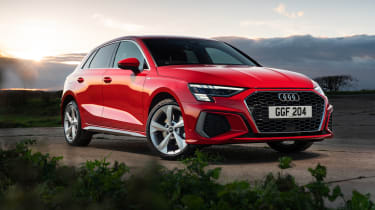
Audi A3 – design
A flurry of slashes, angles, flicks and LED lights has turned the previously elegant design into a fussy melange
The A3’s exterior design has always been a similar story to the interior: combine a classless sophisticated look with just enough sporting paraphernalia to appeal to the target audience. Well, just like the new A3’s interior, subtlety has taken a back seat in favour of flashing lights and complicated angular surfacing as the new A3 fits all of Audi’s latest design ideas into an overstuffed little package.
While not an unattractive car as a whole – the divisive BMW 1-series takes the crown on that score – the A3 has lost its restrained sophistication in favour of deep-set surfacing and complex lighting graphics. All models are shod with standard alloy wheels, but you’ll need to upsize them to at least 18-inches fir them not to not be totally overwhelmed by the new body. The LED lighting front and rear is complicated and lacks the clarity of design that Audis should be known for.
Non S-Line models have a subtler appearance, but if current buyer behaviour is anything to go on, they’ll be out-numbered 4-to-1 on UK roads. You’ll have to look elsewhere for any sense of the restrained design that once defined the A3, and instead deal with the complex body, jarring graphics and fussy detailing that Audi often portray.


