Skoda Superb review – design
Handsome and chiselled, the Superb could pass muster as an Audi, though the understated looks won't appeal to everyone.
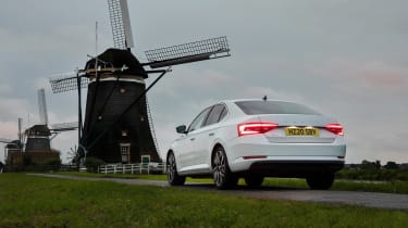
Skoda has consistently overperformed when it comes to the quality of its build and standard of design. Like the new Octavia, the Superb’s aesthetic is defined by the clamshell bonnet up front that totally disguises the shutline and keeps the shutlines clean. The rest of the surfacing and its creases are just as sharp and well-resolved, finishing in a rear end that looks great in both hatch and estate forms.
The facelift brought with it fresh LED lighting front and rear, both of which keep the design looking fresh, while new wheel designs and some more impactful colour options including a deep blue do their own part. Sportline models trade most of the Superb’s brightwork for glossy black, a finish that might sound at odds with the Superb’s target audience, but it does usefully reduce visual clutter, even if Skoda’s gone down the route of insisting on a new script rear badge, replacing the traditional roundel.
More importantly, it also looks expensive. That might seem obvious for a premium-branded model, but the Superb is a car that, even in its most basic form, still dips under £27,000. Aside from a Skoda badge in place of four rings, you’d struggle to differentiate it from an Audi, which we bet Skoda is absolutely fine with.


