Mini Cooper S review – interior and tech
Retro touches can be cloying in places and there’s not much space in three-door models, but it’s well built and the tech is up to date
With three- and five-door bodystyles and a convertible – something not many rivals offered – you got to choose your balance between practicality and looks. Squeezing people into the back of the three-door can be tricky, a job the five-door makes easier, and thanks to the latter’s longer body there’s also a proportional increase in room.
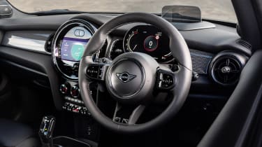
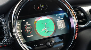
Both got the same dashboard design, an evolution of the pseudo-retro arrangement that began in 2001. The fourth-generation car uses a giant OLED panel and omits any traditional dials ahead of the driver but the round design didn’t make as much sense for the F56 and its square infotainment display.
There was plenty of modern tech though for a car with so many retro touches. Mini’s version of BMW’s iDrive controller still works well and can be largely navigated without staring too long at the screen. A head-up display was available, and you got other touches such as auto-dimming mirrors, auto wipers, mood lighting… old school it might look, but the modern touches are generally pretty good.
The driving position does feel a little off, though. You sit high, but the towering dashboard and high beltline don’t portray this fact, as shorter drivers often need to crane their necks to see the car’s extremities. This is not helped by the upright windscreen, which is placed much further ahead of the driving position than previous generations of Mini, leaving a sort of playing field’s worth of dashboard in front of you.
Basic ergonomics are a bit all over the place too, and despite a recent adoption of a much cleaner half-digital interface in front of the driver, things aren’t exactly the crisp modern feel you expect of most modern cars.

