Mercedes-Benz A-class review – design
Now in its fourth generation, the Mercedes A-class is unrecognisable from the car that kicked things off two decades ago.
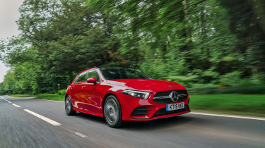
Visually the new A-class still has close links to its predecessor, with a relatively unremarkable two-box form that’s identifiable as a Mercedes-Benz more from its details than any consistent Mercedes design language (and it still lacks the innovation of the first two A-class generations) but place new next to old and there’s little doubt the new car is more attractive than before.
In standard trim the A35 is rather unassuming, and many will like this Q car appeal. However, it's likely a lot of buyers will opt for the £2596 AMG Style Pack that adds an A45-style tailgate spoiler at the rear and turning vanes for the front bumper. Also included are gloss black trim inserts, rear privacy glass and 19-inch multi-spoke alloys in place of the standard 18-inch rims.
The bonnet line seems lower and the new front end with its slimmer grille and headlights is less porcine than before. The same applies to the rear end, though the thinner tail lights sit less comfortably here in what’s still a relatively chubby rump.
Things are better down the sides, where Mercedes’ new design direction has led to much cleaner surfacing without the random cuts and slashes present in the old car’s panelwork, and overall the car looks like it’s been on a bit of a diet - even if, with a starting kerbweight of 1375kg, it’s only 20kg lighter than before.


