BMW M3 (G80) review – still the best reason not to buy a Mercedes C63
The G80-generation M3 is a purists nightmare on paper, but don't let that put you off. It's an incredibly capable and exciting M car, and one of the best modern M3s
In times gone by, BMW’s M range used to be straightforward. There was the small racy one, the M3, and there was the bigger, more relaxed one, the M5. But that was decades ago, and it really is time we moved on, isn’t it? After all, BMW M has – as evident by the current hybrid M5, and the G80-generation BMW M3.
The G80’s challenging design had people up and arms at launch, but there were controversial changes under the skin too. The use of a torque converter automatic transmission and the lack of a six-speed manual option in the UK, for example, plus the availability of all-wheel drive and a substantial weight gain across all its forms. In other words, not necessarily the ingredients you’d pick for an involving M car.
And yet, in part thanks to some of these changes, the G80 M3 doesn’t just shut down its critics, but fights back by being one of the most capable and superbly engineered sports saloons on sale today. It’s not exactly the small touring car-like road-racer we associate with the iconic M3 badge, but the way it combines huge speed with handling finesse and genuine usability is deeply impressive.
More reviews
Group tests
In-depth reviews
Reviews
- BMW M3 Touring 2025 review – the best fast estate gets even better
- Used BMW M3 (E46, 2000 - 2006): an analogue sports coupe icon
- BMW M3 CS Touring 2025 review – the Nürburgring’s fastest-ever estate tested
- Used BMW M3 CS (E46, 2005 - 2006) review – BMW M's forgotten modern classic
- BMW M3 (2007 - 2013, E92) review and specs for V8 coupe
The G80 is only available in Competition spec in the UK and it’s evolved since launch, including becoming four-wheel drive only and spawning a much anticipated (and brilliant) Touring version. There’s also been a more focused CS model, plus a mid-life update that upped the power of its straight-six. As of now it’s more rounded than ever, and few – if any – rivals can match it.
Engine, gearbox and technical highlights
- Eight-speed automatic and now xDrive-only
- S58 twin-turbo straight-six good for over 500bhp
- Switchable to RWD
The M3 Competition utilises a 2993cc closed-deck straight-six engine with two mono-scroll turbochargers. It’s codenamed S58, and is a very heavy revision of the modular B58 unit that’s found elsewhere in the BMW range – to the point that it has totally bespoke headers, intakes, exhaust, internals, turbochargers, cooling and ancillary controls. As a result, it has a slightly different cubic capacity (down 4cc) and produces much bigger numbers than both the B58 and the S55 unit it replaced.
Key areas that distinguish the two motors are the headers and turbochargers. The M3’s headers feature expensive 3D-printed internals that optimise the flow of oil and coolant while also removing excess weight through their additive manufacturing technique, trimming material where traditional methods such as casting or milling are unable to do so. The cubic capacity is slightly down on account of having a larger bore, but shorter stroke, allowing for slightly larger valves.
These bespoke elements complement BMW’s usual roster of valvetrain tricks, including double VANOS variable intake and exhaust timing, and Valvetronic fully variable valve timing.
The crank, pistons and connecting rods are all made of forged aluminium, and the crank pins are spherically ground which help the bearings run more smoothly. This process isn’t often used in production engines of any specification – it’s usually reserved for competition units – but it makes the S58 ripe for further tuning, as featured in the M3 CS.
The turbochargers are two mono-scroll units that each breathe from three cylinders. These again are over-specified for the M3’s 503bhp rating, ensuring that they are well within their operating parameters, making the engine itself actually quite unstressed, which isn’t something you’d naturally say given its extraordinary performance.
For the original G80, peak power stands at 503bhp, with 479lb ft being available between 2750 and 5500rpm, with the limiter coming in at 7250rpm. Facelift models are bumped up to 523bhp, while CS models get an increase to 542bhp, both with unchanged torque figures. The base car reaches 62mph in 3.5sec and runs to a top speed limited to 155mph (this rises to 180mph with the optional M Driver’s Pack.) The CS trims a tenth from the 62mph time, and hits a limited top speed of 188mph.
There is no manual option available for the M3 in the UK, (overseas market base M3s are available with a six-speed manual at no extra cost, although there is a substantial 73lb ft torque deficit to keep it from melting), but the F80 M3’s DCT has been ditched, too.
Instead, the only transmission option on both Competition and CS models is a ZF-sourced eight-speed torque converter automatic. The decision was made to allow for a higher torque rating, yes, but also because BMW says the automatic’s changes are pretty much as quick as they were in the old DCT, and with more time and money to spend on calibration given its use elsewhere in the 3-series range, it was a compromise worth making. The all-wheel-drive set-up is now standard but debuted on the M3 xDrive, using an electronically controlled multi-plate clutch in the transfer case, and in normal driving is largely rear-wheel drive.
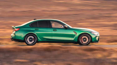
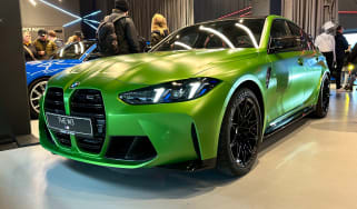
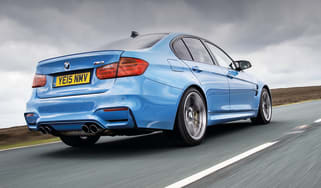
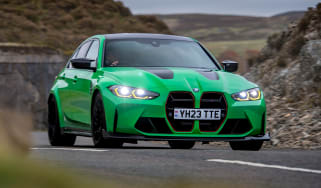
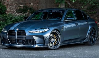
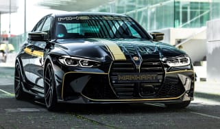
Finally, the chassis has undergone plenty of its own changes. The M3 saloon maintains the usual upgrade package shared with the two-door M4 comprising the bonnet, wings and front fascia. From the A-pillar back, however, the M3 is a curious mix, with standard 3-series in the door skins and bootlid contrasting with the now trademark jutted wheelarches that flare out in a most unusual way beyond the rear door, eventually meeting the very aggressive rear bumper.
The reason for all this is to fit the M3’s substantially wider wheel and tyre package, which sits on wider tracks front and rear. We could go on for hours about the detail changes to the chassis, and there are many, but what you need to know is that both the spring-strut front and five-point multi-link rear suspension are bespoke, mostly made up from forged aluminium, with bespoke geometry and adaptive dampers.
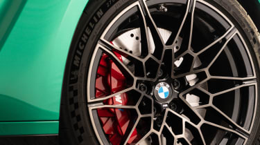
Some pretty extreme negative camber and geometry give much more confidence to the steering, while the EPAS system itself has been totally reworked, giving the steering much more precision. The wheels are staggered for the first time on an M3 saloon, too, with 19-inch wheels and tyres at the front and 20-inch versions at the rear. Standard rubber is Michelin Pilot Sport 4 S, but Cup 2s are available as an optional extra.
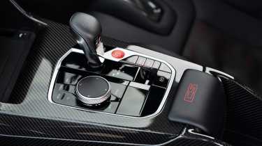
The CS, meanwhile, gets comprehensive changes to improve its track performance, such as reworked chassis software systems, bespoke suspension kinematics and hardware, plus standard-fit forged wheels. Carbon is used for the bonnet, front splitter, rear diffuser and rear spoiler. There are also carbon seats and a lightweight centre console, contributing to a 20kg saving over the 1780kg Competition. There’s also an aluminium strut brace across the engine bay to stiffen the structure.
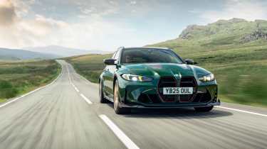
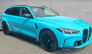
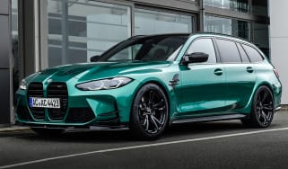
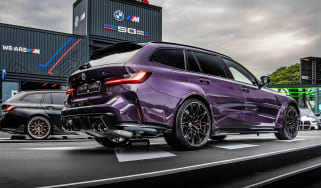
The Touring (available in Competition and CS specs) has its own changes from the b-pillar back, borrowing a version of the M4 Cabriolet's rear under-body brace to make up for the lack of a rigid rear bulkhead – it also has a different set of rear dampers. The result is that BMW M has kept the interior loadspace identical to the standard 3-series Touring and even the opening rear glass built into the tailgate.
Driver’s note
‘The CS Touring is one of the best modern M cars I’ve driven. It’s so malleable and approachable on track but most importantly, it brings a wonderful gritty edge to the M3’s on-road dynamics that make it addictive. It’s the king of fast estates.’ – Yousuf Ashraf, evo Senior Staff Writer
Performance, ride and handling
- S58 is intense and responsive with a broad reach
- Hugely improved body control over F80
The S58 motor fires with a satisfying burble. It may be augmented through the speakers, but it’s as authentic a sound as you could hope for. Outside, however, even with the exhaust valves open, the latest emission filters stuffed into the system result in a rather muted tone, but it has a certain timbre and hollow resonance that suits its brutish appearance.
It’s an engine that impresses instantly. There’s a sharpness and responsiveness to the throttle action that you don’t expect from a turbocharged motor, and a sense that there’s been a great deal invested to get this just so. It’s not Ferrari or Porsche levels of rapid response, but the M3’s straight-six certainly doesn’t feel or sound like an engine that originally saw service in a performance SUV. A handbuilt in-line four or a CSL’s straight-six it might not be, but it’s streets ahead of the F80 M3’s power plant, both in terms of response and overall performance.
It’s the reach of this engine that you can’t get away from. Regardless of the gear you’re in, there is either just the right amount of torque to catch a ride on or you find yourself in the peak of the power band and able to judge each 100rpm increment with measured movements of your right ankle. As the revs rise the soundtrack builds, matching the pace to each octave for an immersive experience.
Find somewhere for the new M3 to let rip and the result is a car that disguises its bulk like it has no right to. The responses are instant, the speed it gathers unrelenting, piling on as the revs rise and your gear selection gets higher. Very quickly you’re short-shifting, forgoing the buzz of the engine’s higher echelons for the torque shove that’s so accessible, and in the process hopefully avoiding a trip to a magistrates’ court. Its predecessor was quick, capable of getting you to the next braking point at a considerable lick. The G80 not only betters it, but does so with more sophistication and tangible depth of quality.
Another improvement is the fact that it no longer wants to hurl you into a ditch the first time you open the throttle on anything but a billiard table-smooth surface. You sense the improved body control within the first few miles; the ride feels more settled – though for some it will still be too harsh even in its softest setting – and more capable of absorbing the surface and being able to filter out the unnecessary noise. The springs and dampers feel more compliant and more suited to the road, softer in their actions and working in tandem with the stiffer shell that has allowed BMW M’s engineers to tune the chassis accordingly.
On a tighter road there’s great stability under braking, with just enough pitch to not be distracting, and what lean there is as you commit the nose is at a level you can work and push against rather than having to constantly manage. With more time and experience you soon find yourself asking more of the 275mm-wide front Michelins, the resistance building through the steering wheel as they bite harder. And then it’s down to how early you want to open the throttle. With xDrive you can do this very early indeed.
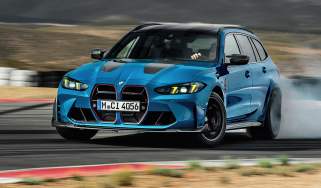
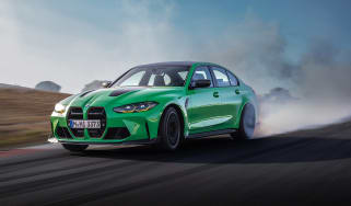
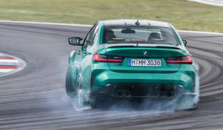
The system finds immense traction but also has a wide window of adjustability if you select the more rear-biased 4WD Sport mode. Switch to rear-wheel drive on a greasy surface and you realise how much the four-wheel drive system is helping you, with big slip angles available at will. Even so, you can balance the car and generate good forward momentum if you’re smooth on the throttle.
It’s on quicker roads, where the surface bucks, twists and throws up a horrid camber or two, that the G80 makes the largest gains over the car it replaced. There’s so much more composure coming back at you, with a front axle that feels more determined to seek out grip and a rear that’s able to work with the surface and flow with clarity rather than try to hammer it into submission.
Only when there’s a loss of grip at the rear axle do the front driveshafts come into play, their keenness to intervene depending on whether the car is in its standard 4WD setting or in 4WD Sport, the latter setting biased towards a rear-wheel-drive handling style. Like the M5, you can also choose to disable the ESP system completely and then force the car into a purely rear-wheel-drive setting, too. Much of the four-wheel-drive hardware is bespoke for the M3/M4, and the xDrive also has its own front suspension tuning and geometry over the now discontinued rear-drive car, plus the engine’s oil system has also been upgraded.
The CS brings a welcome dose of extra aggression and precision to the experience. It feels more sharper and more connected than the base car with a vivid, raw edge to the driving experience, particularly in the dry on Cup tyres. In damp conditions it can be more spiky and less approachable than the Competition, however, and the gap narrows between the too.
Driver��s note
‘The M3’s looks polarise opinion, but those able to consider the car behind its front grille will find one that delivers an all-encompassing driving experience. Its straight-six has enormous shove but it doesn’t dominate the experience, overwhelm the chassis or make the driver feel they are doing little more than hanging on.’ – Stuart Gallagher, evo Editor-in-Chief.
MPG and running costs
BMW quotes 28mpg for the M3. That figure is just about achievable on longer journeys and motorways, rising to over 30mpg in average-speed roadworks that seem to make up 50 per cent of the UK’s motorway network at the moment.
The numbers look different when you start making more use of the performance, easily dipping to the low 20s on faster commutes and far below when the full might of the straight-six is unleashed. Track useage will see this drop to single digits – not unusual, but then the track also reveals some of its other running cost considerations, which have grown alongside its weight and power figures.
On a dry, high-grip surface an M3 on cast iron brakes seems to quite happily munch through a set of brake pads over the course of a day’s hard track use, the standard Pilot Sport 4 S tyres not being much more long standing. That’s not down to the compounds of either, it must be said, but a consequence of the M3’s kerb weight and aggressive suspension geometry.
The ceramic brakes stand up to track use better, but their replacement value, if a disc does go (unlikely, but not unheard of)... we’re talking big numbers. So while the M3 is certainly a resilient track day weapon, the job of keeping it in tip-top shape will be an expensive one.
Interior and tech
The interior, of course, comes from the 3-series which in the G80’s generation is no bad thing as quality, space and technology have all taken a big leap forward. Facelifted M3s pick up a redesigned dashboard layout that replaces the integrated screens for the floating curved unit that's now proliferated across the BMW range. This is a good thing in general, as the screens are both huge and easy to use, and aside from the removal of a few physical controls is a broadly excellent update.
From a performance car standpoint, though, the new M3’s interior is defined by the fantastic seating position, which like the Porsche 911’s is able to sink lower than you imagine possible. This is especially true of cars fitted with the M Carbon bucket seats. If you too are slightly wider of body you might find the exaggerated bolsters a little tight for comfort, and regardless of your size, getting in and out of them isn’t for those who favour easy ingress and egress. Certainly worth a try before you buy. We’ve also yet to work out what the little carbon tray at the front of the seat’s base is for. BBQ dip from the drive-through, perhaps.
Of course, there’s a thick-rimmed steering wheel; it wouldn’t be an M-car if there wasn’t a rim that required hands more suited to a slip fielder.
BMW M3 Competition long-term test
By Adam Towler, evo issue 296
‘Alas, the time has come. It’s goodbye to evo’s long-term test BMW M3, and while the nice man who took it away just so happened to drop off an M4 xDrive to take its place on our Fast Fleet, that car soon moved on to a different custodian. Sob. We’ll introduce our M4 to you next month, but I’ll share one early observation on it in a moment.
But first, I never felt like I had a fair crack at the Alfa Giulia Quadrifoglio, my previous long-termer; it was lockdown, the law said leave it parked, and often there was nowhere to drive to anyway. It was the way it was. But the world had shifted enough by the time the M3 arrived that it could be driven, and the near-12,000 miles it had racked up by the time it left us are testament to that. Actually, the first 2500-or-so weren’t at our hands, as YA70 TWV had first served time on the general BMW press fleet. BMW UK had a batch of Isle of Man Green M3s registered for media duties at the model’s launch with near identical regs, hence you may have seen YA70 TWU in our triple test with the Alfa and a white 992 Carrera back in evo 287, and other examples elsewhere too.
The story of our M3 is one of conversion. When it arrived, it was a 1730kg monster with a face only a mummy monster could love, it had a price inflated from £74,905 basic to £86,745 thanks to options, and of course, like all M3s in the UK, it had the only transmission on offer – a torque converter. As I’m old enough to remember driving E46 M3 press cars when they were new, and grew up with E30s and E36s, this doesn’t fit my mental image of a ‘proper’ M3 at all. Coming from the exuberant Alfa, I fully expected to hate the BMW and spend six months sniping that its peculiarly pungent sauerkraut wasn’t anything like as appealing as the Alfa’s fiery Milanese salsiccia.
Of course, if you’ve read any of my previous M3 reports you’ll know that I rapidly changed my mind, and although I find it nearly impossible to separate the Alfa and BMW – despite having written a group test that featured the pair of them and run both for six months each – the fact I’m not placing the Italian car in front will always surprise me.
So what didn’t I like about the M3? Oddly, it’s hard to pinpoint anything specific that grated during my time with the car, bar the obvious demerits we found when we tested it initially. I actually grew to accept the grille treatment, and loved the wide-arched, gunslinger stance when viewed from the front, but I’m still no fan of the overall exterior design and could say the same for the interior, which is overwrought to my eyes. In particular, I couldn’t stand the dashboard displays, which offered so much user configurability when you really delved into the submenus, but still failed to provide a rev counter that was easy to read at a glance. How can this be so? It’s almost as if the people who design this stuff have never driven a car. Thankfully, with a press of an M button it was possible to get a preconfigured combination of oil, coolant and tyre temps/pressures, and the head-up display offering a clear rev counter with speed. Still, if you can remember when BMW interiors were paragons of ergonomic efficiency with those lovely, simple dials, this does not feel like progress.
Yes, the auto ’box lacked the positivity of an M DCT at high revs, the steering was good, but not M5 CS good, the car sometimes felt its weight on a road with a challenging topography, and… that’s about it really. It could be reasonably frugal on a long run, reaching nearly 30mpg, but was never spectacular in this regard. A tank of superunleaded seemed to go quite quickly if you really had the straight-six singing.
Despite being turbocharged, it’s that 503bhp ‘six’ that I’ll remember the most about the car, just as earlier M sixes have been a crucial element of classic M-cars of the past. It produced power and torque virtually everywhere and gave the M3 incredible performance. Well, that and the abilities of the rear-wheel-drive chassis, which could be deft and precise or loutish on command, and the variable traction control, which was amazing too.
In the end, I came to see the M3 as an M5. Its weight and dimensions aren’t far off those of an E60 (V10) M5, although the M3 has vastly more low- and mid-range torque. It has other qualities you’d associate with the bigger car, too, including a smooth auto ’box, superb long-distance comfort and amazing seats – the expensive (£3400) M carbon bucket seats may look like they prioritise lateral hold over comfort but I found them brilliant on long journeys as well. This isn’t an M3 as we knew it: it’s simply grown up.
The M4 xDrive was an interesting postscript to our rear-wheel-drive M3, and also prompted words I never thought would leave my mouth: I would have the xDrive version over a rear-drive M3/4 any day. It truly is the best of both worlds. It also appears that BMW has finessed the augmented engine noise in the cabin, because the M4 sounds much more ‘convincing’ than our M3 ever did. But none of this detracts from the unforgettable six months I spent with a remarkably desirable big saloon.’
Prices, specs and rivals
The G80 generation has brought with it some curious variations in trim and specification that can quite dramatically vary how much your M3 will cost. The base price is a rather substantial £91,315, but that can easily rise to over £100k with a few options.
Most extras are grouped into packages, starting with the M Driver’s Pack, which ups the top speed from 155mph to 180mph and signs you up for an Advanced M Driver’s Course – yours for £2175. Next up is the M Race Track Pack, which bundles the above with a set of carbon-ceramic brakes, carbon fibre interior trim and carbon bucket seats – yours for £15275. The £7825 Ultimate Pack, meanwhile, includes an electric bootlid, heated steering wheel, a parking assistant, adaptive LED headlights and carbon exterior trims.
Opting for the Touring rather than the saloon adds just over £2k to the list price, while the CS saloon and Touring models cost around £30k more than their Competition counterparts.
The BMW M3 Competition’s rivals are in something of a state of flux, with AMG’s latest C63 – traditionally a close rival – being well off the pace in terms of charisma and involvement, and the Audi RS5 having been recently taken off sale.
Instead, the M3’s greatest challenger comes from Northern Italy. The £86,885 Alfa Romeo Giulia Quadrifoglio pulls at the heartstrings like few others, and while its powertrain might match the BMW’s, the car as a whole is significantly lighter, making it an even quicker car – if you can get the power down. This lack of weight also gives it a much more delicate character, something doubled down upon with relatively soft spring rates and preference to flow with the road surface rather than pummel it into submission.


